In addition to template requests, Vivipic has received some letter from users asking about design skills and tips. Therefore, we have decided to let our designers regularly share some design skills with you, talk about the hidden functions of the editor, and how to make the design more beautiful and more in line with your mind.
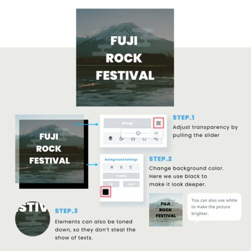
Mixing texts and objects together is one of the key problems of making the image look pointless. With Vivipic’s editor You can easily adjust the transparency by pulling the slider, so the second-tiered texts and elements will not steal the show of the main topic.
- Select the suitable elements to set off the texts.
- Pick the color that matches the main visual image.
- Pull the transparency slider.
You will not only enhance the readability of the texts, but also create a multi-layered visual effect!

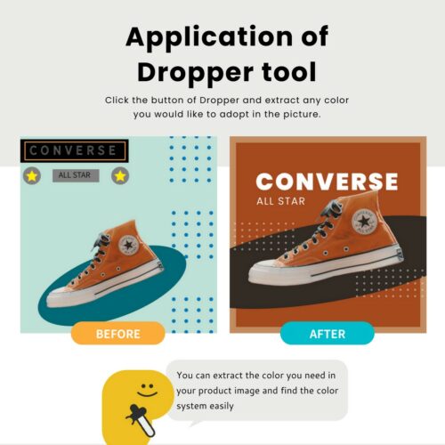
According to consumer behavior research, about 80% of consumers pay attention to the brand color when shopping which makes it important. The keys that affect color are “hue”, “lightness” and “saturation”. Hue is used to distinguish colors, lightness refers to the brightness of the color, and saturation is the vividness of the color.
One of the key points of creating textured product image is to choose low-saturation and low-brightness colors. Moreover, selecting a color with a high degree of connection with the product makes the picture look harmonious.
In the use of hues, warm colors such as red, orange, and yellow are quite suitable for the catering industry and have the effect of stimulating appetite. The technology and financial industries use cool colors such as green, blue, and purple, which bring stability and trust to consumers.
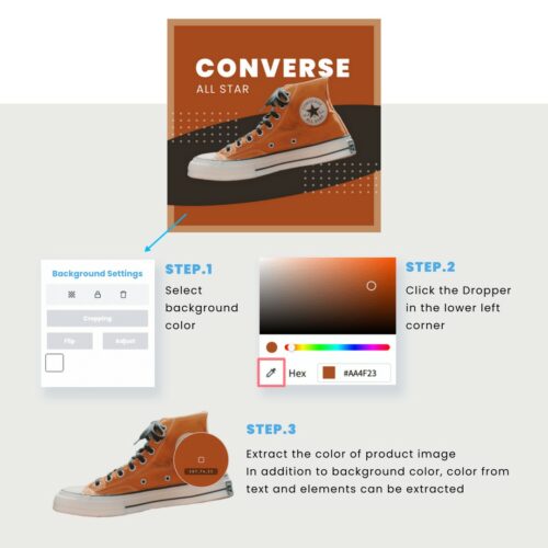
- Click the colored square button on the right toolbar. The gradient color frame allows you to choose the color easily.
- Click the button with a Dropper pattern in the lower left corner.
- If you want to use random color matching, the color extraction function would be helpful.
Vivipic’s Dropper tool is a very handy tool for those who are struggling with color matching!
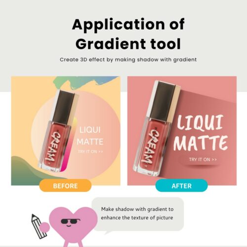
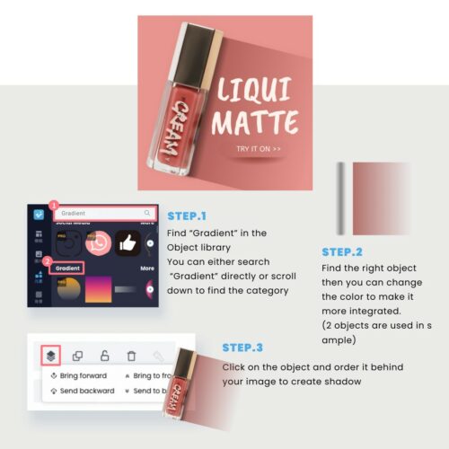
If you want to make your image more visually prominent, you can use Gradient elements to enhance vertical and horizontal difference.
- Start with texts or products first and select gradient elements that echo the selected products.
- Select a product image with a solid color background.
- Search for “gradient” in the Objects library on the left, and place the gradient elements on the edge of the product to create the effect of light and shadow.
For more information and ideas, please go to https://vivipic.com/ or Contact: service@vivipic.com
